CASE STUDY
Governor Baxter
A fresh new brand wants to project a big lineage.
How I branded a one-person startup to compete with large established players.
The situation:
Governor Baxter is a side business, a one-person company with very few products and no physical location. The key to branding was a focus on their deep Maine connection. Rustic. Natural. Historic. The owner was a distant relative of Percival Baxter, the 25th governor of Maine, famous for acquiring Mount Katahdin and creating Baxter State Park. Despite being small and new, the company wanted to project a substantial and established image that integrated their family history.
It’s rare for a fresh young brand to have one hundred years of history to draw upon.
* Note: I created the look and brand voice for Governor Baxter over two versions of the website separated by ten years.
My original approach:
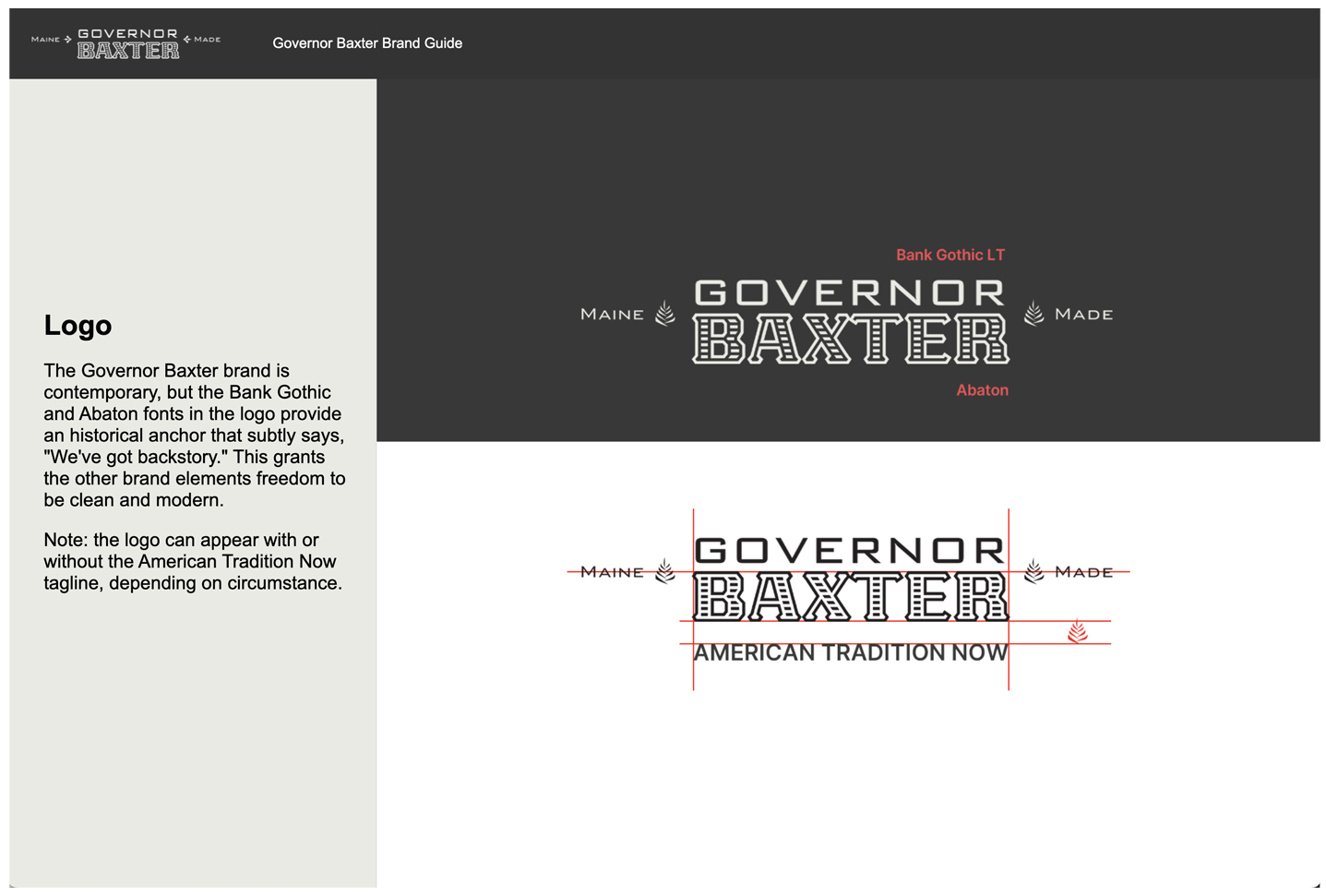
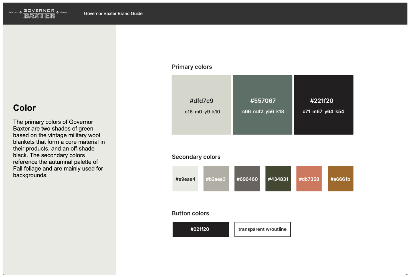
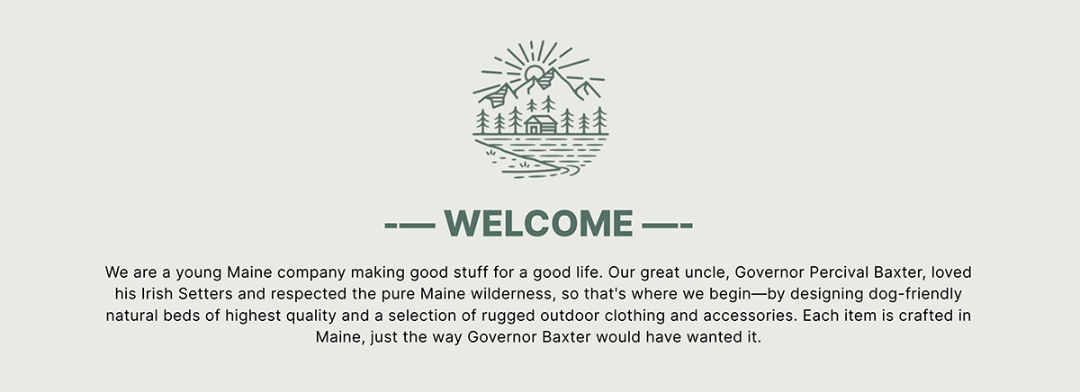
I began by researching a trove of family archives to design a brand that references and highlights the provenance of the company. This begins with the logo, which blends two formal and subtly nostalgic fonts with a political campaign pin from 1921. The site typography was limited to EB Garamond serif for headlines and direct address to the viewer, and a simple Helvetica Neue sans for the main work of body copy. The color palette was restrained to a minimal selection of rustic colors reminiscent of a Maine autumn. Historic photos are intermingled with product shots.

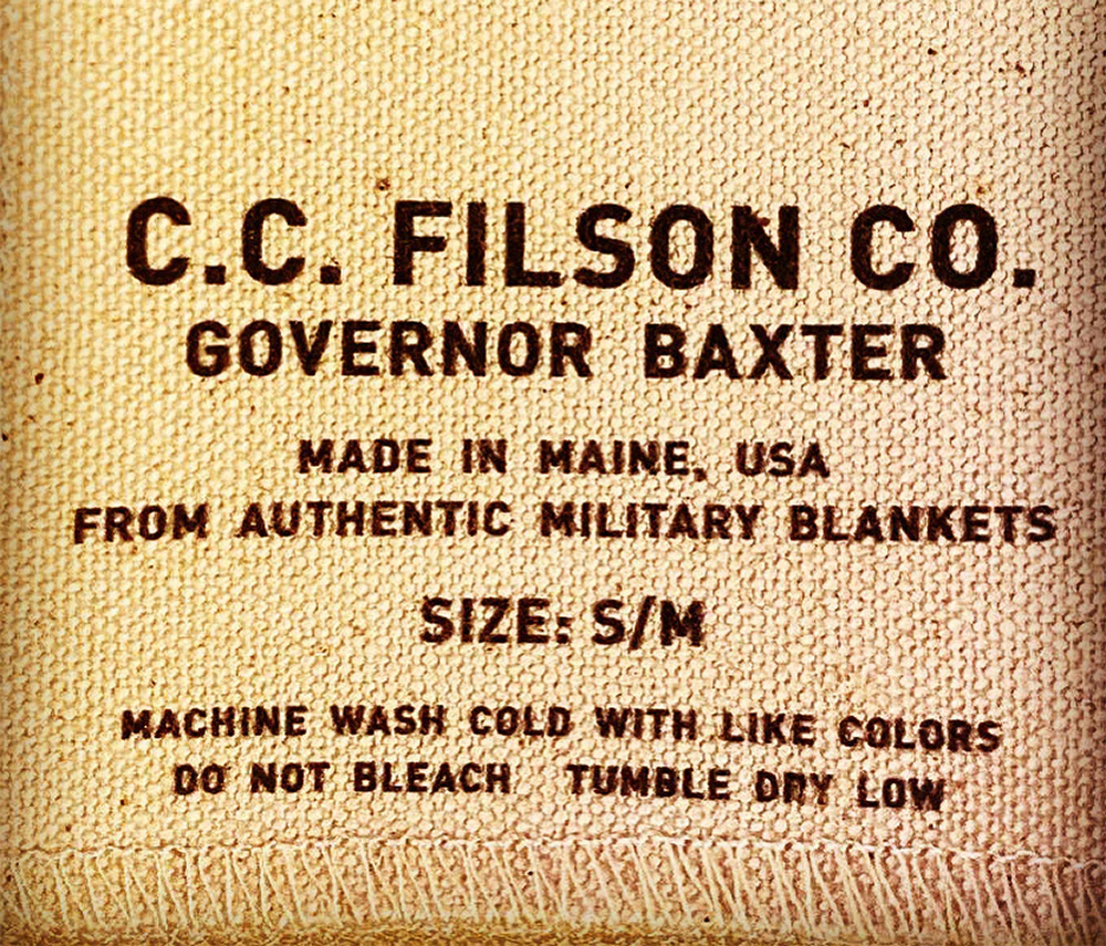
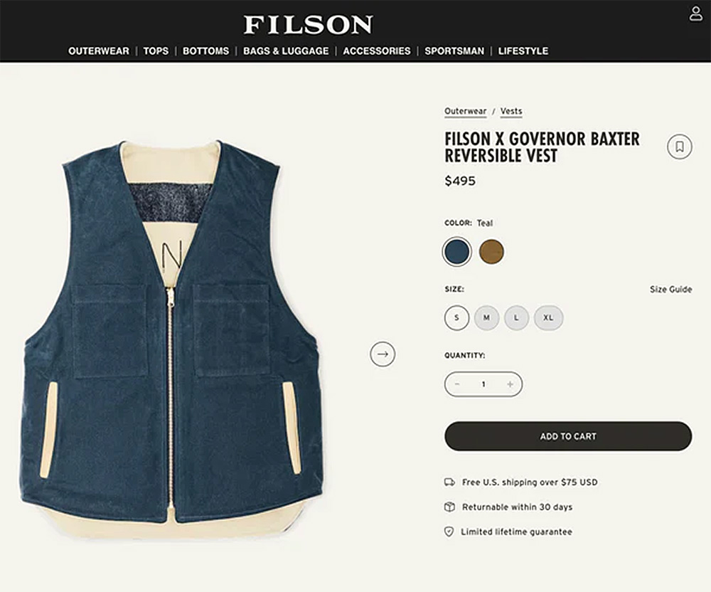
The site was designed to work with a WordPress theme and WooCommerce plugin for sales. Many of the products were stitched with authentic World War II military blanket material, so the wool texture forms a background frame around the site content.


My update:
The original site was built in WordPress with a WooCommerce plugin. This worked fine for the few products with their minimal variations. But as the portfolio of products and their complexity of variations (size, color, material, fastener, etc.) increased, I moved the site to Shopify for better ecommerce functionality. It was also an opportunity to update the brand, keeping the historical references but modernizing the look and feel, and projecting a larger enterprise.
I rebranded the brand I originally branded.
Gone are the wool texture pattern and the dark color palette. The rebranded colors are muted and monochromatic. The lighter palette gives more prominence to an expanded library of product photography. The headlines are a more assertive bold sans-serif to match the body copy (both Inter) and a nod to the previous site’s serif font remains only with the sharp-serifed Libre Baskerville for the Governor Baxter title in the main hero element.
See BRAND GUIDE
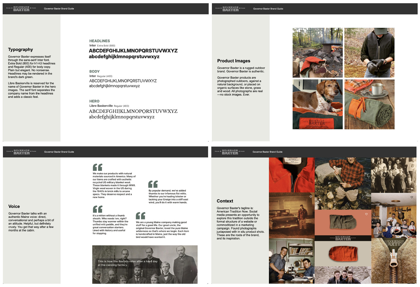

The historic family photos are given their own page, and a new emphasis on the Maine landscape is added. The Governor Baxter Instagram feed with its mix of product and American cultural history is featured on the homepage. The voice of the brand (I wrote all the headlines and body copy) is casual and authentic, and unabashedly Maine.


The result:

Since launching the sleek rebrand, including press releases and social promotion:
- Online sales have jumped over 300 percent.
- Governor Baxter has been in contact with Filson, the established outdoor clothier, for a co-branded vest collaboration.
- And Down East magazine has published two features on Governor Baxter and its products.